Return to all projects

Clarity in a crowded market

Burnley Brewing

Project Overview

Role:

Brand director

Period:

2023

Skills:

Brand strategy

Positioning

Identity

Burnley Brewing is an independent Melbourne craft brewery with a 250-seat taproom in Richmond. It had a solid product – quality beer, strong values, and a loyal community – but the brand wasn’t telling that story clearly. I led a series of strategic changes to sharpen the positioning and bring its strengths to the spotlight, building an identity that felt true and helping it stand out in a noisy market.

Burnley had a clear internal identity, but it wasn’t translating. Strengths weren’t being communicated clearly, which meant the brand wasn’t leveraging what made it unique.

Key Issues

Before
Before_Can Before_Sock Before_Sticker
Funky_Search_GIF

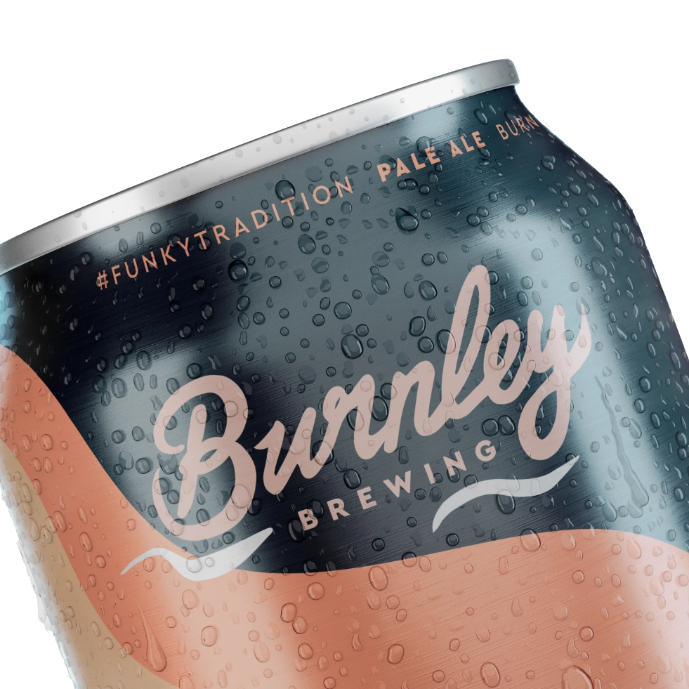
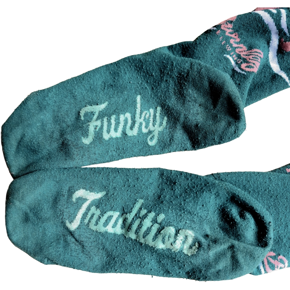
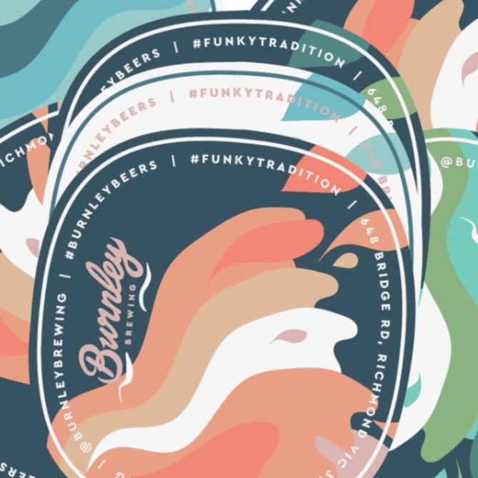
The old “Funky Tradition” slogan didn’t land and didn’t speak to our German brewing roots. People associated it with sour beers, which only added to the identity confusion.

Before
lager-grid

The industry knew us for top-notch lagers, but it wasn’t part of the story externally. We weren’t owning our place as a brewery that nailed the classics.

Before
Community_Bushfire_Fundraiser Community_Sponsorship_HAFC Community_Sponsorship_RCS
Eco_Project_Before

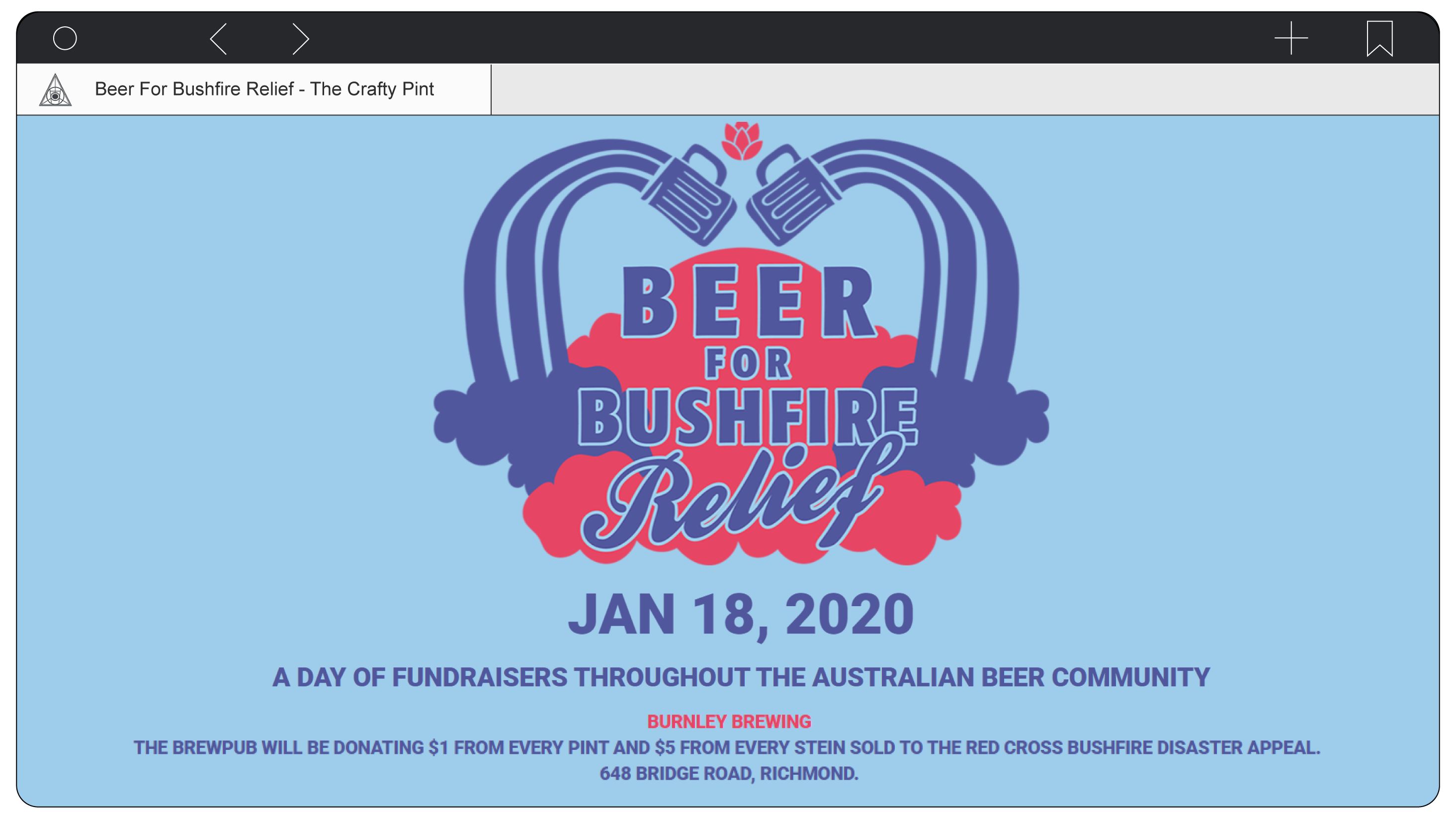
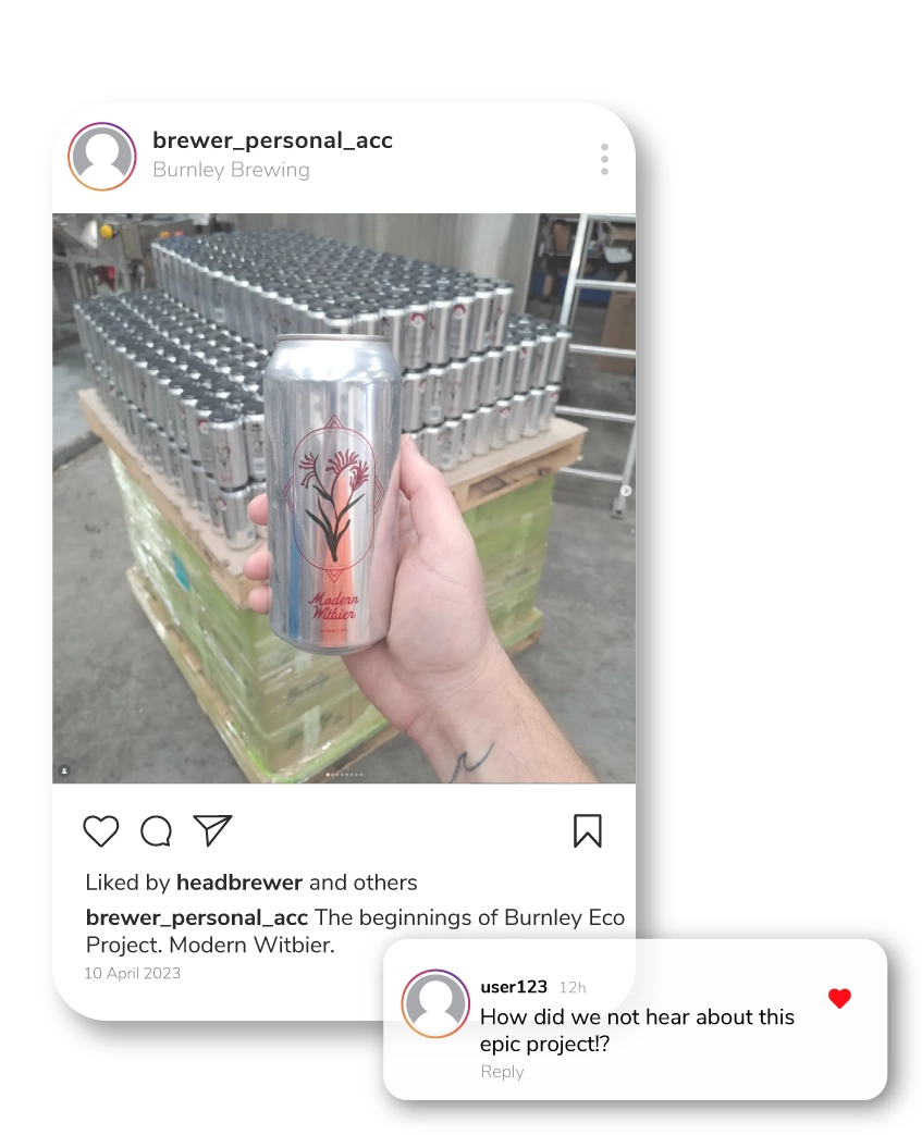
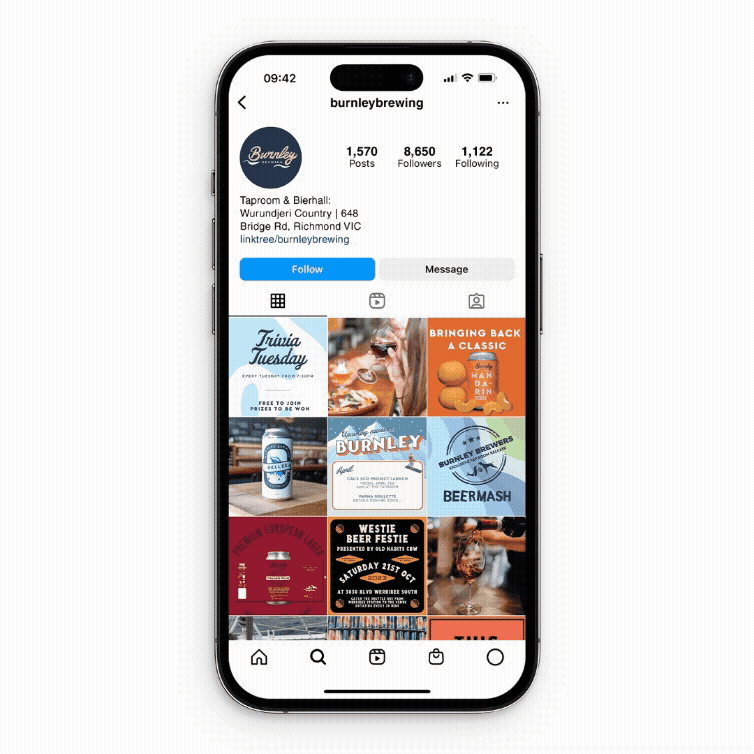
Burnley was doing great things; community programs, inclusive initiatives – but nobody knew about it. The heart was there, but the story wasn’t. Without that connection, our efforts didn’t translate into real brand growth.

Before

As the business grew, the branding became messy: different voices, visuals, and messaging across touchpoints. It needed pulling into line.

Article_Cards

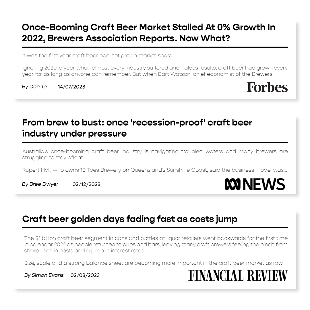
COVID kicked off a craft beer boom. Breweries popped up fast to meet the growing demand for packaged beer, often leading with bold, experimental styles. But as things settled, demand dipped, the market crowded, and drinkers shifted back to classic, easy-drinking styles. Meanwhile, most breweries stuck to the same branding formula: edgy, blokey, and industrial. In a market this packed, standing out meant offering a fresh point of view.

We needed to bring sharper focus to the brand’s positioning, tell a more cohesive story, and show up with consistency across every touchpoint, without losing what made it warm, local, and real.

I created “German Inspired, Melbourne Brewed” to fuse Burnley’s traditional brewing know-how with its youthful, vibrant local presence. Blending tradition and innovation in one line; it’s simple, memorable, and says exactly who Burnley is: a brewery rooted in heritage but built for now. The new line was rolled out across every can, displayed at events and baked into the brand’s central story

Motto_Logo
Motto_Cans_GIF
Motto_About_Page

Lagers are a big deal. They don’t hide flaws – demanding precise fermentation, long aging, and rock‑solid consistency batch after batch, with few hops or adjuncts to cover mistakes. I wanted to turn that test of skill into our selling point, leaning on our German training and aligning the brand with quality and precision. So we used packaging and playful socials to highlight our love of lagers, dropped more limited-edition brews, and made quality the story with behind-the-scenes content showing the craft of our beers.

Live_Laugh_Lager_Packaging
Lagers_Solution_Story_GIF
Lagers_Solution_Grid_GIF

I made sure Burnley’s values were front and centre. From formalising community programs and revitalising messaging around a sustainable brew series to launching new projects like Community Kegs and collabs with underrepresented voices, we made our values part of the story. Everything we did was communicated clearly, so people actually saw it, got it, and cared.

I led the creation of a comprehensive Brand Guide, finally making Burnley’s look and voice match its ambition. We brought back core elements like the hero font Fenway Park and the wave motif, while formalising newer assets – the secondary ‘Dog & Seal’ logo, mascot Harry, and our playful illustration style – and rolling them out more broadly. With our in-house designer on visuals, I drove consistency that made every touchpoint unmistakably Burnley.

BrandGuide-Part-1_The-Brand
BrandGuide-Part-2_Visual-Identity
BrandGuide-Part-3_Packaging

The slogan stuck. Pubs, bottle shops, and punters started quoting it in menus, social posts and reviews. That kind of organic pickup made Burnley easier to remember, talk about, and share – no extra explaining needed. Internally, it became a compass for everything from product launches to venue tweaks, keeping everything aligned with that blend of old and new.

We leaned into our lager expertise, and the market responded. People started calling Burnley 'champions of lager in Australia' and recognised the skill behind our beers through awards and social posts. Burnley came to stand for quality, care, and classic brewing done right.

Once we started communicating what we stood for, Burnley came across as a brand that gave a damn, and people got behind it. Digital engagement and community turnout increased. In a space that usually skews masculine, we connected with new audiences – women, LGBTQ+ folks, younger drinkers, and families – through relevant, ongoing initiatives.

The refreshed system made Burnley instantly recognisable across product, social, and in-venue materials. The return of bold, playful visuals made the brand feel alive again, while consistency across channels saved the team time and created a solid, scalable look ready to grow with the business.

Brand-Consistency_Impact_Secondary-Logo
All Projects

Next Project:

Let’s work together